
Inspired by a shot on Dribbble from Morgan Allan Knutson where he showcased an animated search form using only CSS I thought I would try to re-create the effect for myself. Using a bit of CSS3 magic, the effect is actually quite easy to re-create!
(It looks like the iframe embed isn't so hot for a few people so try this link instead https://jsfiddle.net/anatomic/XPYWB/embedded/result/)
HTML
The HTML behind this effect is very lightweight:
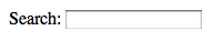
<form class="search" action="" method="post">
    <label for="search-box">Search:</label>
    <input id="search-box" type="text" name="search">
</form?
As you can see there really isn’t anything to the HTML, it’s lean and semantic. I’ve left out the submit button (you can hit Return to submit the form) but for production use I would probably include it to increase the usability of the form.
Breaking down the markup, the form has a class of search, uses the http POST method, submits to itself and has a label and a text field. The label is targeting the text field (to aid with accessibility) and that is it!
Styling the label
So now we have the basic form in place and it's looking pretty ropey! Not to worry though, it won't take long to get this thing looking slick and tidy with a bit of CSS.
Firstly, let's hide the label as it's not really needed for this effect (though I should hasten to mention that all form inputs should have a supporting label element). Instead of setting it to display:none, we'll instead hide it off-screen so that users with Screen Readers or other accessibility needs can see it.
.search label{
    font-size:0.75em;
    font-weight:bold;
    color:#333;
    text-indent:-9999em;
    display:block;
    float:left;
}
A quick note about progressive enhancement
It's probably a good time to explain that this effect isn't going to work for all users on all browsers. Rather than it looking like a total abomination we can use the excellent Modernizr to offer a nicely styled alternative for users without such CSS goodies as border-radius, multiple backgrounds, transitions and gradients. I haven't included a write-up of how to use Modernizr here (and it's not really included in the working demo either) as it's well documented and would probably deserve an article in its own right.
Back to the effect…
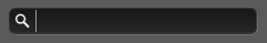
Making the text field a button
The premise of this effect is that you see a button which, on clicking, turns into an input field so to start we're going to remove all the horrible base styling and make this input field look buttonified. I've chosen to round the corners slightly, add a CSS gradient background to give the appearance of volume, a border and a CSS drop shadow to help enhance the visual effect and the finishing touch is a magnifying glass icon to tell the user that this button relates to search. Phew.

The code looks something like this:
.search input[type="text"]{
    text-indent:1px;
    padding:0 0 0 22px;
    width:0;
    height:22px;
    background: -webkit-linear-gradient(top, rgba(100,100,100,1) 0%,rgba(80,80,80,1) 10%,rgba(22,22,22,1)100%);
    color:#999;
    line-height:20px;
    font-weight:bold;
    -webkit-text-shadow:1px 1px 1pxrgba(0,0,0,0.05);
    text-shadow:1px 1px 1pxrgba(0,0,0,0.05);
    -webkit-border-radius:6px;
    -webkit-box-shadow:1px 1px 0rgba(0,0,0,0.125);
    cursor:pointer;
}
For the sake of brevity I have only included the webkit specific prefixes but you should include the standard alternatives for Mozilla, Opera and the vendor-less CSS.
The basic shape is created by setting the width to zero and letting the padding give the box some width. This ensures that any text won't be seen and when the input is fully expanded later the cursor will be positioned to the right of the icon. You may also notice that there is a text indent applied, this is because you could just make out 1px of the first character if the input contained some text.
The key CSS3 elements are the background, border and box shadow as they create the button look. The background is made up of two parts, my magnifying glass icon (a transparent png) and a linear gradient with three stops. The icon is positioned to centre it in the button and, importantly, is set to not repeat - if we don't then we'll get lots of little icons when we expand the input field later!
To get the shadow etc. looking nice I've chosen to use RGBA colours (which again can be swapped out if the browser doesn't support them using Modernizr) with a lower opacity mimicking the sort of values that I would have typically used in Photoshop.
The border combines with the CSS drop shadow to create a nice embedded effect and the button effect is completed with a slight rounding of the corners. To finish the button effect off, the cursor is set to pointer to give it a real button feel (thanks to @csswizardry for pointing that little extra out!)
Changing to an input field.
As we want to change the input when it is clicked, we shan't be hooking into the :hover CSS pseudo class and instead will be using :focus.
Again, it's probably easier to show the code than explain it so here it is:
.search input[type="text"]:focus{
    width:200px;
    outline:none;
    background:url(http://www.ian-thomas.net/examples/search-icon.png)2px 2px no-repeat, -webkit-linear-gradient(bottom,rgba(100,100,100,1) 0%, rgba(40,40,40,1) 2%, rgba(22,22,22,1)100%);
    -webkit-box-shadow:1px 1px 0 rgba(255,255,255,0.125);
    cursor:text;
}
Essentially we are inverting the gradient in the background, changing the box-shadow to a highlight and adding an arbitrary width (this can be set to match your design). The cursor is also changed back to text (as it's now in "input" mode) and I've removed the outline (is this naughty?) as I don't like the blue highlight that it gets in Chrome.
Bringing it all together
There's just one thing missing and that's the transitions. As with most of this stuff they are pretty straightforward to implement, with the code looking something like this:
-webkit-transition:width 0.5s ease-in-out;
A bit of an anti-climax don't you think? To explain it all fully, I've chosen to animate over half a second (so it feels nice and responsive) and have added easing at the start and end of the transition. The other thing that's important to note is that the transition only affects the width. If we were to set the transition to affect everything we would also see the background and box-shadows animating and the effect would be pretty nasty.
That's it! I hope this has been useful for you, if you want to see the effect in action (and the HTML and CSS that powers it) you can hop over and view it working on jsFiddle.